TIME SQUARE NYE OOH
Client Coca-Cola / Agency Wunderman Thompson NY / CD Tian Mulholland / CW Anthony Roberts / AD Johari Huggins / Illustration Johari Huggins
Coca-Cola
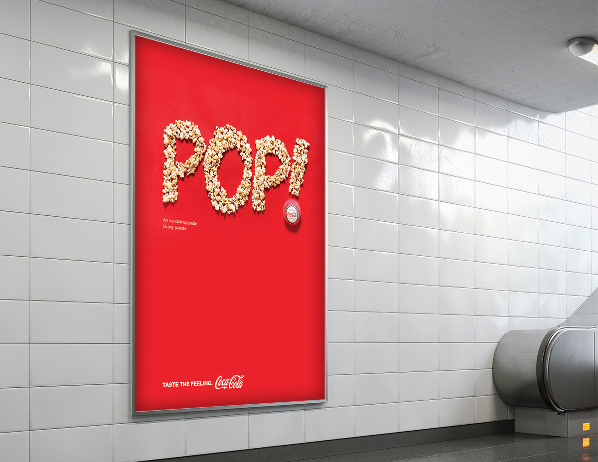
In order to celebrate 2023, Coca-Cola wanted to turn their iconic Times Square billboard into a giant New Year’s Resolution. Instead of focusing on self-serving goals, we decided to offer ideas that brought care into the world—like Give More Hugs, Spread Love, and the ever-important Keep the Plants Alive!
PITCH CONCEPT
Agency Burrell Chicago / CD Christine Saldanha / CW Anthony Roberts / AD Johari Huggins
Coca-Cola
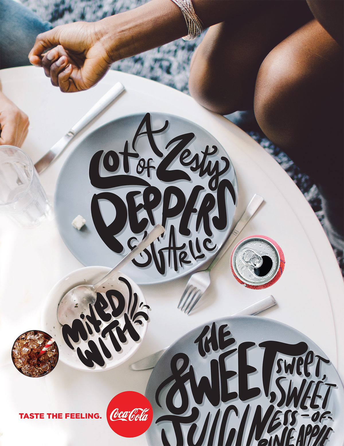
Our task was to introduce the Taste the Feeling campaign to the African-American market. We decided to use typography and lettering to emphasis the sound effects and descriptions of food in order to elicit personal memories. This helped make the idea of food surprising and playful.
Animated Social Post
Agency WT NY / CD Tian Mulholland / AD Johari Huggins
Samsung
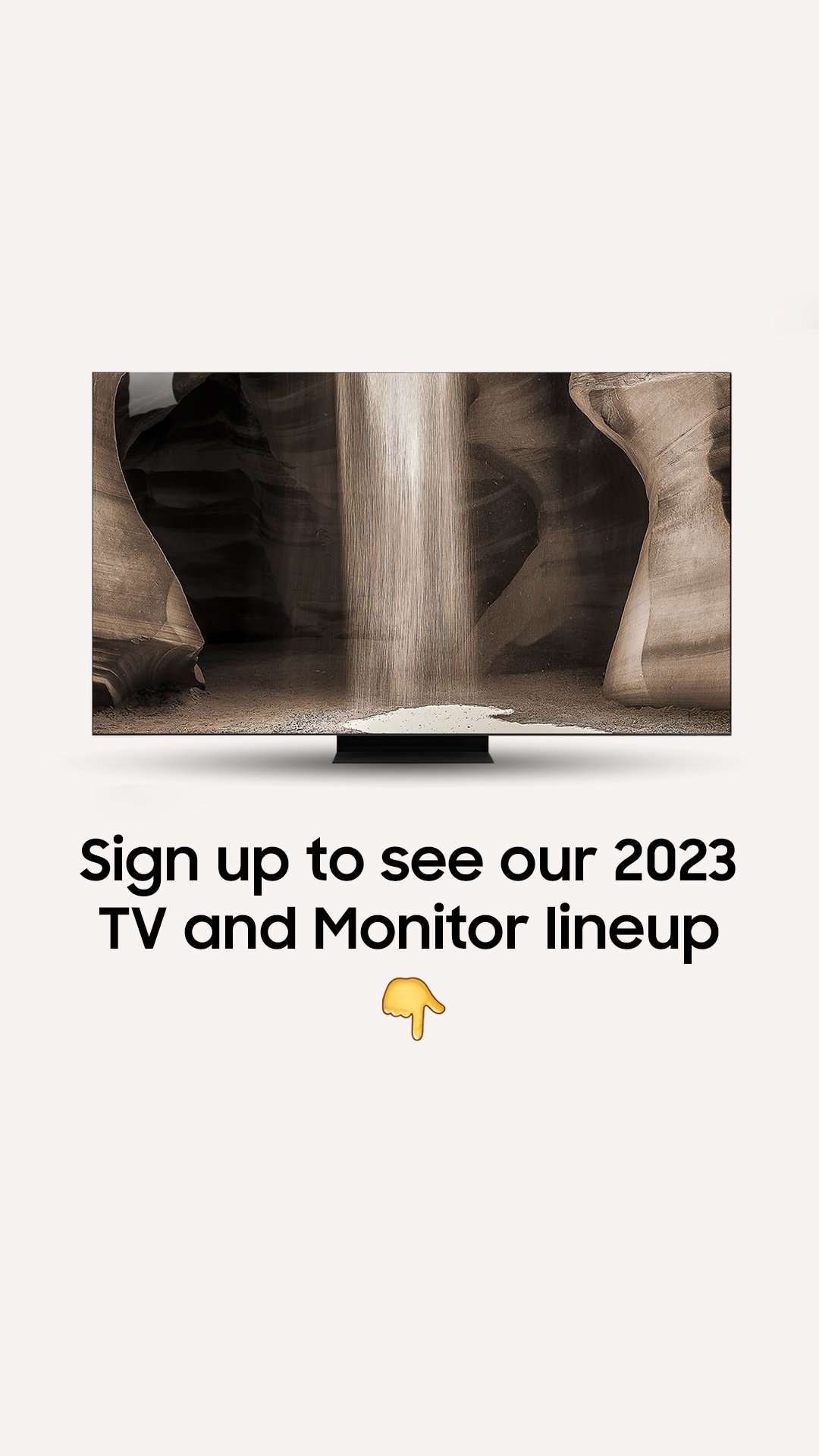
To promote the launch of their new, ultra-thin TV during the CES convention, Samsung teased the product on social media. I paired the image with the brand’s signature typography to exaggerate the thinness of the screen that eventually rotates to reveal its crystal clear facade.
MULTI-CULTURAL PRINT
Agency Commonground / CD/CW Eduardo Tua / CW China McGee / AD Johari Huggins
American Family Insurance
Challenge: As the multi-cultural agency-of-record for American Family Insurance, our print ads followed a template from the general market agency. In the grid-based template, each rectangular shape featured a unique image. Our budget, however, only allowed for the use of royalty-free stock photography. Most images appeared disjointed and busy.
Solution: I proposed that instead of unique imagery in each container, we allowed one primary photo to serve as a background image that spanned multiple containers. This allowed for breathing room within the layout and made the best use of limited stock photography options.
OOH
CD Mike Williams + Rob Clifton + DJ Webb / CW China McGee + Anthony Roberts / AD Johari Huggins
American Family Insurance
I created an OOH poster to promote a short-film produced by American Family Insurance during the American Black Film Festival (ABFF). We were restricted from the use of photography so I created visual hierarchy using a typographic layout.
PRINT + RETAIL PACKAGING CONCEPTS
Agency TPN / CD Bryna Ogletree / CW Ken Krimstein / AD/CW Johari Huggins
Jockey International
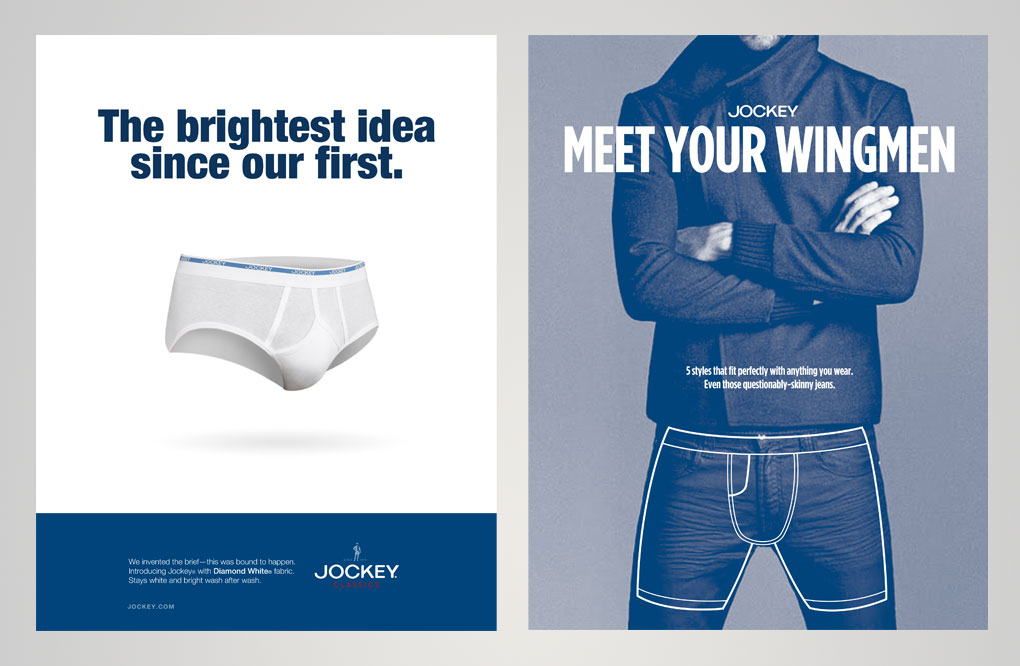
I created concept packaging for Jockey to support their shopper marketing expansion, along with print ads to support brand messaging. The goal was to modernize the brand to reflect their recent partnership with celebrity stylist Rachel Zoe, as well as refreshing their legacy product—the tighty whitey.
WEB BANNERS
Agency WT NY / CD Tian Mulholland / AD Johari Huggins
Infor
When tasked to explore web banner designs that modernize the IT giant, I designed a series of icons to represent their various industry departments. Each industry highlighted its unique, gradated colors from the underutilized brand standards palette. The flexible design also included a text-only version and an iteration that replaced the illustrated icon with a photo.
PRINT
Agency Ogilvy & Mather, Chicago / CD Joe Ondrla + Karen Smith / CW Monica Haddock / AD Johari Huggins
graphic design
AD + Illustrator Johari Huggins
DIRECT MAIL
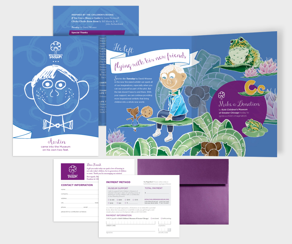
Client Kohl Children's Museum / Agency Commonground / CD Mike Williams / CW China McGee / AD + Illustrator Johari Huggins
VARIOUS STATIONERY
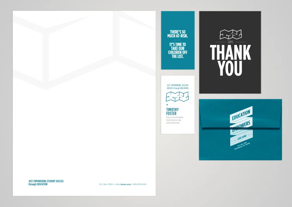
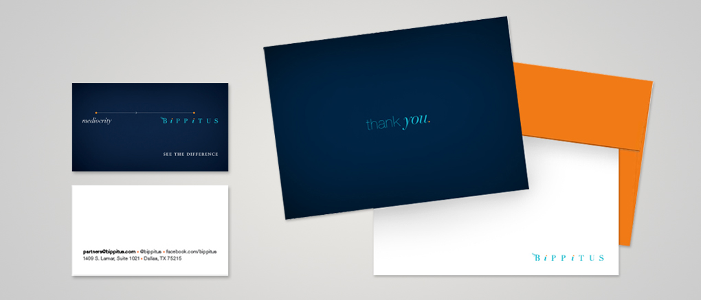
AD Johari Huggins


